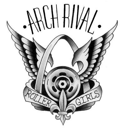
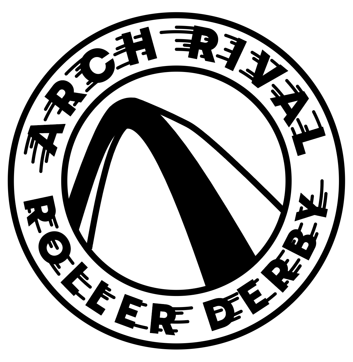
Arch Rival Roller Derby was established in 2005, right at the start of the modern wave of roller derby. The league's logo hadn't changed since then, and by 2018 it was time to freshen it up.
Some of the issues included:
• Poor legibility due to fine lines and details, especially when reduced in size
• Gradients caused problems with printing
• Unusual silhouette made integration with content-heavy pieces difficult
• Use of full league name in the logo restricted flexibility of use
• Many design elements were generic within roller derby (wings, ribbons, wheels) and/or St. Louis (Arch, fleur-de-lis)
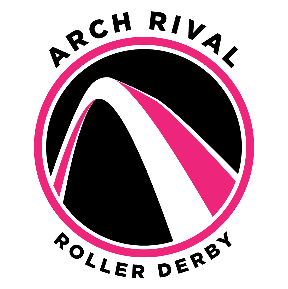
I took on the redesign with feedback from a small group of leadership within the league. Another designer in the league worked in parallel, and our two final designs went to the league for a vote, with my logo becoming the new mark for the league.
Logo Exploration:


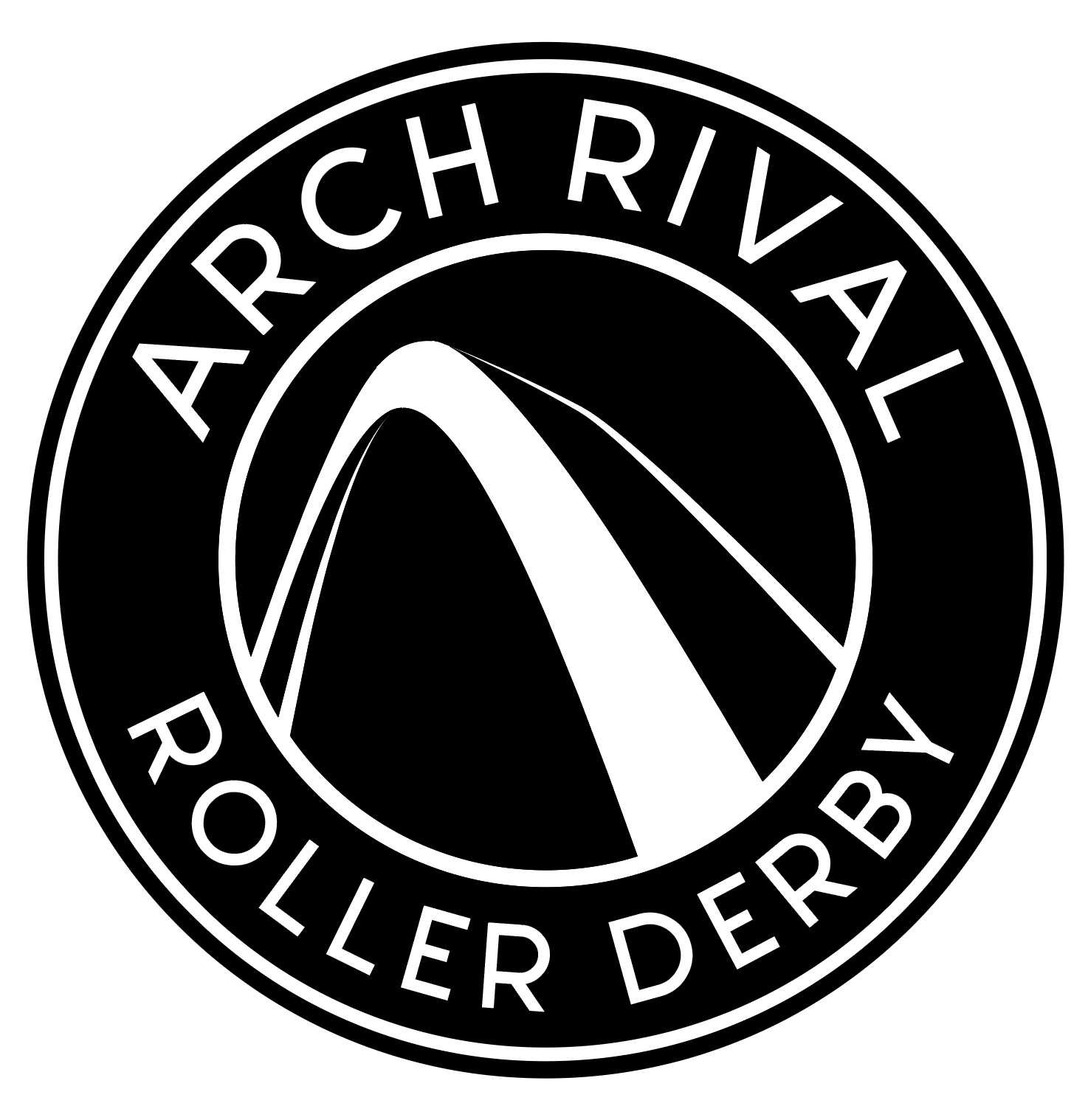
Final Logo
Rationale:
• Arch is recognizable nationally but the perspective makes it distinct locally
• Dramatic angle suggests energy and motion, reminiscent of the speed and agility of the game
• Framing the Arch in a circle makes it more versatile in placement for design
• Logo would still be recognizable without text
• Simple design that remains legible at even the smallest sizes
• The concentric circle holding device is reminiscent of a roller derby wheel
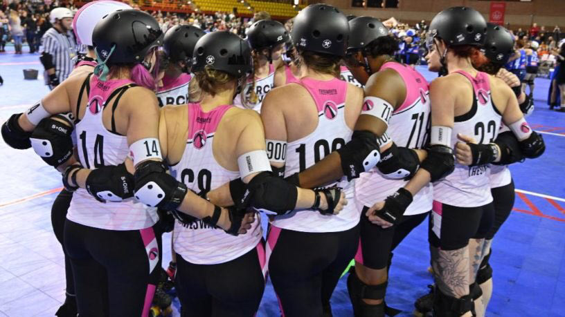
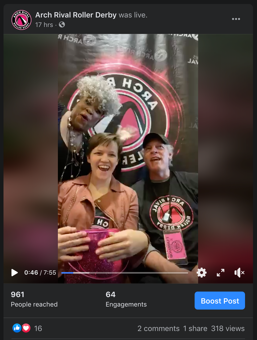
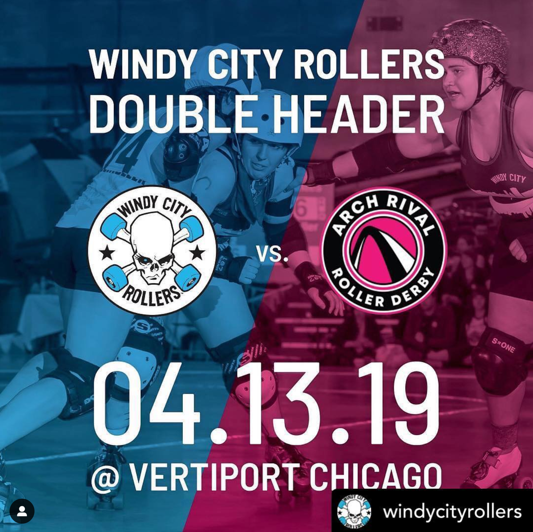
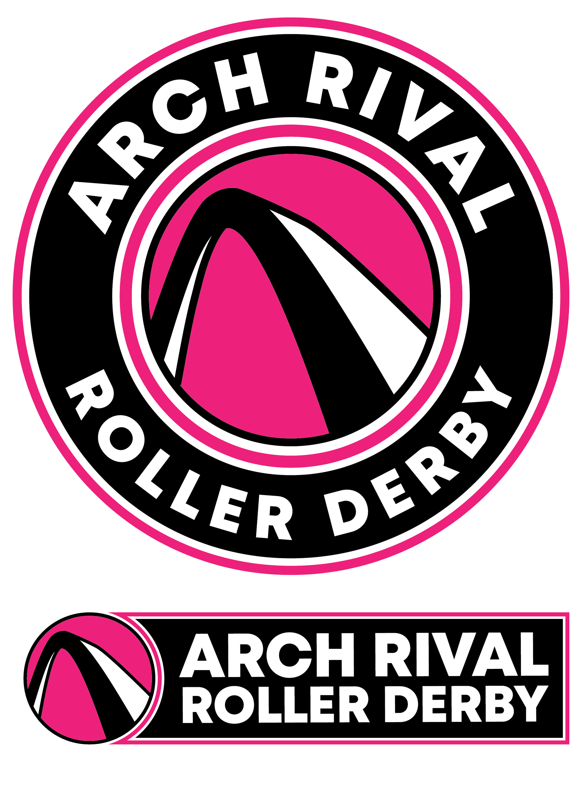
New Logo Usage and Feedback